User Research

User Interviews

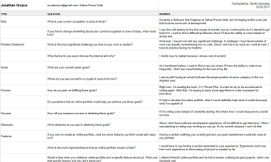
The User Interviews allowed me to interview potential users for my website. I mainly wanted to interview hiring managers and developers. After all, those two would be the individuals looking at my portfolio. I had to opportunity to interview two software developers. I mainly focused on asking them about what they expect to see from an online portfolio. This allowed me to have a good understanding about what people within the industry expect to see in a portfolio.


Image of User Interviews

Click on the image to view the document.

Competitor Analysis

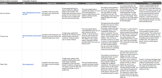
The Competitor Analysis allowed me to inspect other websites to see their strengths and weaknesses. I evaluated three different portfolios from prospective software engineers. I chose these mainly because I aspire to become a software engineer. For each one, I analyzed and wrote down their strengths and weaknesses. By doing this, I avoided incorporating any weaknesses that the competitors had. I also attempted to incorporate some of the strengths that the competitors had. This allowed me improve my portfolio compared to others.


Image of Competitor Analysis

Click on the image to view the document.

Feature Value Matrix

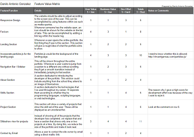
The Feature Value Matrix allowed me to outline every feature that I wanted to incorporate in my portfolio. I selected several features that every portfolio should contain. The features that I selected were created from the feedback that I had received from the user interviews. I also included unique features such as particles.js and a slideshow view. This allowed me to have an idea of what I needed to implement for my portfolio.


Image of Feature Value Matrix

Click on the image to view the document.

Feature Prioritization

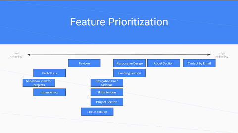
The Feature Prioritization helped me visualize what features had to be prioritized. Every feature was given a number for their user, business, and dev value. The combination of these three determined their priority. During development, the features that had high priority were implemented first. A Linear Model and Kano Model were created in order to see the prioritizations.


Image of Feature Prioritization

Click on the image to view the powerpoint.

User Testing

User Stories

The User Stories allowed me to create various personas to better understand the requirements for different types of users. Every story was focused on an individual that could potentially encounter my portfolio. Users could be hiring managers or developers. This allowed me to ensure that I was meeting the requirements for a specific user.


Image of User Stories

Click on the image to view the document.

Cognitive Walkthrough

The Cognitive Walkthrough allowed me to experience how a user would interact with my portfolio. The users would be asked to complete various tasks pertaining to the portfolio. The one leading the discussion would document the user's interactions. This allowed me to visualize how a user would interact with my portfolio. If the user had any difficulties, then there is a possibility that other users could experience them too.


Image of Cognitive Walkthrough

Click on the image to view the document.

User Test

When conducting the User Tests, I mainly used click tests and navigation tests. I used click tests on my mobile interface. The reason for that was to ensure that the user was still able to navigate through the portfolio. I also wanted to see whether the content within the navigation bar was clear. This is where I used the navigation test. Overall, the click test was successful, but the navigation test displayed some flaws.


Click on the image to view the tests.

Summary of Findings

Through the user research, I gained an idea of what users tend to expect in an online portfolio. Once the portfolio is created, then different users have to use/view the portfolio. Conducting user testing, helps you identify where your portfolio might be lacking. Developers might be biased and think that their portfolio is perfect. Most of the time this is not the case. I know it wasn't for me.

I was satisfied with my initial version for my portfolio. Specifically, I thought that the styling and structure were great. For example, by conducting user interviews I concluded that a single page would be better instead of a multiple page portfolio. Even though I was content with my portfolio, there still were issues with it. The most notable one was accessibility issues. When I was conducting the user tests, many users found it difficult to locate where my previous employers were at. Considering that they were restricted to only using the navigation menu. This is where the issued was located at. It was obvious to me where the section would be located at, but not to the users.

By conducting all of the research and testing, I realized that I didn't take one major factor into consideration. The ease of use for my portfolio. If someone is viewing my portfolio on a mobile device, then the navigation menu might be confusing at first. Instead of having a regular navigation menu, I should have a hamburger menu with the icons and description. Mobile users also have difficulties viewing the slideshow of my projects and previous employers. Instead of having a slideshow, I should consider having a tiled design layout. This would ensure that mobile and desktop users could view all of my projects and employers without having to click the right arrow. In summary, the main issues that my initial portfolio had was accessibility issues.

Incorporation of Findings

For my updated portfolio, I wanted to focus on the idea of ease of use. There were certain features that I incorporated such as a better navigation menu. There were also features that I didn't have time incorporating such as a hamburger menu when you view on mobile, tiled design for projects and employers, and a way to contact me through email without having to open a mail client.

By conducting user tests, I realized that the navigation menu had the most issues. Initially, users would have a difficult time locating the employers section by only using the navigation menu. This is understandable because of the way I had my navigation menu links named. What I ended up doing was reformatting the structure of my portfolio. I changed the naming of the navigation menu. Instead of having a "projects" link, I replaced that with a "experience" link. The experience link would redirect the user to the first section related to my experience with coding. This would follow my idea of ease of use, mainly because users would now be able to locate every section that is related to my experience using only the navigation menu.

Certain features weren't brought to my attention, but I thought they would be ideal for my updated portfolio that was focused on ease of use. When a mobile user is using my portfolio, I display an ordinary navigation menu. By doing this, I removed the description of the link and only included the icons. I tried to select icons that would accurately represent the section. It might have been clear for me, but not for other users. What I had to implement is a hamburger menu when the screen is small enough. This would ensure that there is no ambiguity between the icons. There is also room for improvement within my contact section. My contact section requires the user to open a mail client to email me. Instead, I want to create a form where the user could input their information and message. Once they do that, they'll have the ability to just send link through those forms. The issue with that would be that I required a backend using either NodeJS or PHP. I didn't have time to implement these, but I will definitely include them on my next portfolio.